Thursday 19 December 2013

Crackle effect

This is a technique which has some interesting results. It is the application of gum arabic to a layer of BIG (Baldwin's Intaglio Ground) resist. 

1. Apply BIG in several thin layers and heat until cured (it becomes very hard like a varnish)
2. Allow to rest for 45mins to 1hour. 
3. Lightly dust with talcum powder.
4. Paint on gum arabic, preferably in a thick layer to make it stronger. Thick layers make bigger cracks but less of them, thinner layer makes more cracks which are thinner. 
5. The plate is heated on a hot plate, the gum shrinks back exposing the resist underneath. It is very unpredictable, and you can end up exposing too much resist.
6. Carefully take off the resist with cotton wool and white spirit or Lincoln Wash.
7. Carefully wash off the gum arabic with water. 
8. Etch the plate. You can do an aquatint before this process, but I didn't, not wanting to spend too much time on it.
9. Clean up the plate and it's ready to print.


A larger experiment in colour printing.

This is one of my favourite buildings, the rather sombre Hornsey Town Hall in north London. It's Art Deco and has some fascinating ironwork and staircases. I loved the back and forward quality of the stairs and how enclosed it was, so used a strong red as the diagonal and under stairs shading.
So I put it to good use as a colour print. There are 2 layers to the print- the etched zinc plate, and a thicker mylar sheet with drypoint. It's quite large for an experiment, about 45x36cm.


Colour printing

I've done some printing in colour. After buying Etching in Colour by Nigel Oxley I learned how to do a correctly registered print, using the same plate, but with different applications of ink, layered onto the same piece of paper. It has been something I've fought shy of for 3 years, being unsure of getting it right. Why did I wait?

The first print was a combination of drypoint scratching on a sheet of mylar inked in yellow, then blue and magenta on the original etched plate, printed over. the mylar didn't last very long, and I hadn't quite sorted out my exact registration. The second print is a combination of the mylar, then printing the magenta only on the toy itself, and finally the blue on the background. During this experiment I had to use scrim (muslin) to apply and brush the ink off, which is a better way of doing complicated prints, rather than using yellow pages which makes it hard to see where you're brushing.

The second type of print was made by inking only certain areas of the plate, then reprinting with different colours. It gives some really interesting colour combinations.


This is the original black and white print, which a friend has described as 'spacey'. He was spot on.


Wednesday 16 October 2013

Drawing in the Garage

I haven't done some drawing for a while, so have been itching to get observing the details in my home.
This is the garage where I do printmaking. The drawings were made on the iPad with Procreate app.

First line drawing

Usual lighting of strip lights.

The sun is out and is shining through the skylight

More extreme lighting.


Monday 2 September 2013

Experiments part 2

This is the next little set of experiments using different resists.

SHARPIE pen
I've heard of people using Sharpie permanent marker as a resist, so had to try that out as I'm always looking for ways to mask out areas precisely. Its fantastically fine detail, and works on an open bite etch. It doesn't work with icing sugar aquatint though, it cleans the BIG (Baldwins Intaglio Ground) off the plate.


More open bite experiments- the drops of white spirit work really well as marks, and the wipes on the lower two prints are just a cotton rag with a little white spirit wrapped round my finger. The 2 plates are printed twice- the first versions have more ink wiped off than the second ones; just to see how they would look if treated differently.


The final print is great if you want a blackboard and chalk look. The Sharpie on the right didn't work- it just cleaned the resist from the plate, not helpful really. The Caran D'Ache water-resistant crayon was good, in steps (left side of print). Candle works well as just a rough texture. A good challenge would be to try and make a print by using only crayon and candle. 


The next print will hopefully use some of these marks.

Wednesday 24 July 2013

New printmaking experiments

I've been very busy doing science experiments.
In the quest for non-toxic ways to make etchings I've been away from the blog messing around in the garage, but now its time to post all the results.

First- copper sulphate solution has replaced my old nitric acid etching, and has been a massive success.
I followed the examples from Zea Mays printstudio's website:
http://zeamaysprintmaking.com/green-printmaking/technical-pages/etching-zinc-copper-sulfate-mordant

The etching works on a sub-atomic level (!), swapping particles of zinc and copper, rather than corroding the metal with nasty acid. The positives are great- you can do it at home, you don't lose your fingers, and there are no fumes to harm you. Obviously you won't want to eat the stuff, but there is not much else which can harm you. If you want to take it up there are numerous websites explaining the method. I get all the supplies from HawthornPrintmaker.

BIG

The best resist used for copper sulphate etching on zinc is BIG- Baldwin's Intaglio Ground. It is rolled on the zinc plate like lino ink, but in thin layers. You can draw on it, press things into it to take the resist off in patterns, and then heat it to make it hard and tough. Along with other videos you can see it at work here:
http://www.printmakingstudio.co.uk/index.php?option=com_content&view=article&id=67&Itemid=30

Copper sulphate line test- times measured in minutes


Icing sugar aquatint
This has totally revolutionised the way I do aquatint. Rosin is the traditional way, which is very toxic, and has been linked to cancer, so I wanted to stop using it right away. For a very good guide on icing sugar aquatint visit this page:
http://zeamaysprintmaking.com/green-printmaking/technical-pages/icing-sugar-aquatint-10

The aquatint is actually better than any I've done using rosin. Its very reliable, and has an even tone.

Test print of icing sugar aquatint

Coffee Lift
This is usually called Sugar Lift, but I'm using a strong Nescafé and hot water mix. It enables a lovely painterly or ink drawing style to your line. Its a bit like working in reverse- adding to take away. The coffee drawing when dried has BIG carefully rolled on top, then baked to cure into a hard ground. Leave it for an hour to set fully, and then in a bath of comfortably hot water gently stroke with cotton wool. the areas you painted with coffee will float off very quickly. Pat dry and then you can either etch straight away, or add an icing sugar aquatint on top (for lovely dark areas).

Coffee lift plate with icing sugar aquatint laid, ready to etch.


Etched and ready to print. The lighter grey areas were etched at 2mins then covered in a resist to stop bite, then and the darker areas for a further 5mins.

The print


Looking at the lighter tones- they should be darker, and even maybe the same as the darkest. 


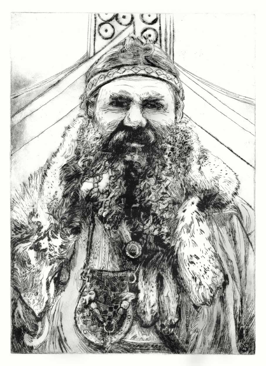
A combination of line and aquatint


plate bitten and ready to print


The print. 

The lighter areas at the top is where I didn't cure the BIG enough. Also the white lines show that the ink wasn't pushed into the fine lines enough. I'll have to get an old fashioned dabber to fix this.


Wednesday 12 June 2013

Some Viking illustrations

I've always been interested in the Viking life in York, especially the colourful and detailed costumes. The textures are beautiful, and its great seeing the people transformed through the costumes.


New big drawings

After thinking very hard about my artwork and deciding which direction to go, I have started doing large drawings again.

These images are 3 stages of a drawing to show the inside of a giant 300 year old hedge. It is c70x60cm and drawn with pencil, Conte crayon and chalk pastel.
Looking at the final version I would do the next drawing more like the 2nd stage image. There seems to be more mystery and the composition draws the eye into the centre of the hedge. I like the 'meaty' quality of the picture, as this is my style of drawing, and is satifyingly dramatic. It was great to just concentrate on the act of drawing, feeling the discoveries coming from looking, and expressing that within the image. I did a lot of drawing on my Fine Art degree, but afterwards didn't really have the space to continue.

Ideally there would be another 11 large drawings, to make 12, a good number for a possible exhibition. Also I've been thinking of turning this one into a very large etching, but am still hunting for facilities to accommodate a A1 size piece of zinc, and a press large enough to take a paper margin too. It may be a drypoint, as the quality of line is gorgeously fluffy and velvety, a perfect quality for looking into dark spaces and spidery branches.


More Procreate app paintings

Since making the first painting on iPad with Procreate app, I've become addicted. I'm mostly interested in how well it handles colour, and the smudgy messy brush marks.
It has also made me more confident with painting, as I've always been a bit scared and not let myself enjoy it.


New New Kings Cross drawing

During a quick trip to London I made a new drawing of people at Kings Cross station, because it has been totally redesigned since my first drawing back in 2010. Its like an inverted lily-pad of light. If you know the station I was sitting upstairs at Benito's Hat. It is an amazing space, and I think there's a lot more material to explore, especially the newly revealed areas which were hidden from view over the last 40 years by the hideous 1970's canopy. 

This drawing will probably become an etching. Hopefully with colour too. The seats in the drawing are green and orange, and the roof is soft blue with electric blue lights. The first step is to explore the space and composition of the scene. Then colour it in, because colouring-in is fun! I will keep posting updates of course.


Monday 22 April 2013

Ian Dury print

Here's a new lino print. It's inspired by the 'Sex and Drugs and Rock and Roll' film, which is a brilliant biopic of the life of Ian Dury and The Blockheads (a British proto-punk rock band of the 70's and 80's). I really loved the German Expressionist mood of a lot of the concert scenes, and along with Andy Serkis's brilliant performance this print had to be made!
The print is 31.6x30cm and is a reduction lino, using 5 colours.


Here's the trailer for the film:


The Viking Drypoint


This is the drypoint print of the 'Big Red Beardy' viking, mentioned in the previous post. Its A3 (29.7 x 42cm) and made on a sheet of plastic, which I've not used before. Its very sensitive to any little marks made with a needle; from very fine gentle lines to deep gouged strokes, and also sandpaper. Its much more responsive than zinc, which I used before. I assume not so many prints can be made with it as it may wear out due to it being a softer material.

Tuesday 12 March 2013

Big Red Beardy sketch

I'm on the path of making another print, an A3 size drypoint of a Viking enthusiast at Jorvik Viking Festival last year.
Here are two preparatory sketches, to get to know the subject.


Sunday 17 February 2013

My Art Nest, made in Procreate app

This is a new app I have discovered and fallen in love with- Procreate, made by Savage Interactive. It was recommended by Rob Shaw, animator for Lupus Films.

I've played with quite a few art apps in the last couple of years, Brushes being the most used, but the simplicity and layout of Procreate really works with the flow of creating pictures. Also, the brushes are great, especially the rougher painting ones, which drag colour along with them like oil pastels. I wanted to practice working with colour in a painterly way, and the fantastic colours and subtlety of mixing really made me feel more confident. Something I've wanted to do since starting art school in the 90's.

For these pictures I imported an already existing drawing of my studio, and started working on top. You can work on layers (which have similar properties to Photoshop) and also you can export your work to Dropbox as photoshop files, with the layers intact. This is great if you want to play around with it on your computer afterwards. The other great feature is the ability to make your canvas really big at a high resolution. The pictures below were made as 40 x 20cm at 300dpi.

I'm considering taking it out drawing around town, to get some spontaneous colour drawings of people.

http://www.procreate.si


Tuesday 29 January 2013

The Carousel

Happy new year everyone.

Here's my first drawing of 2013. It is the carousel which comes to York at Christmas. The drawing was done while leaning on a nearby column, it was such a cold day that after half an hour my fingers had set in the pencil-holding position. Afterwards I went to Costa to thaw and 'play with my felt tips',  to colour the picture up. At home it was finished with watercolour and Neocolor I crayon.  The drawing measures 50x20cm and is on Khadi paper sketchbook (as usual).
I think there's a lot of mileage in this picture, at least one print and some extra drawings.